Resumes
Business Cards
Cover Letters
Do's & Don'ts
Tips & Tricks
What you should really include & what's not necessary
Cover Letters
Business Cards
Cover Letters
Cover Letters are more important than you think...find out how to to make the best one for you
Business Cards
Business Cards
Business Cards
Even with today's global sustainability initiatives, biz cards still reign supreme. Find out how to make them work for you
rEsumes

Most people think recruiters spend at least 5 minutes reviewing a resume. The truth is much scarier. Recruiters spend about 6 seconds before they make the initial “fit/no fit” decision. That means prioritizing information is essential. Keep in mind recruiters and hiring managers have seen every type of resume format imaginable. For maximum wow-factor, you must build a resume that highlights your industry-specific experience, accomplishments, and credentials, as well as important skills.
The Basics
Keep it to one page
Yes, that means you can use both sides. Be sure to include the most important details on that document, and then include a link to your personal website or online portfolio, where you can dive more into what makes you the ideal candidate. Still struggling? Themuse.com has 6 Pro-tips for getting your resume down to 1 page.
Keep it simple
Use a basic, modern font like Arial, or Helvetica at a size between 10 and 12 and leave a healthy amount of white space on the page. To make it easier on the eyes, use a different font or typeface for your name, your resume headers, and the companies for which you’ve worked, but keep it simple and most important keep it consistent.
Keep it recent & relevant
As a rule, you should only show the most recent 10-15 years of your career history and only include the experience relevant to the position to which you are applying. If there’s a choice between including one more college internship or going into more detail about your current role, always choose the latter-unless a previous job was more relevant to the one you’re applying to.
Quantify when possible
This helps recruiters picture the impact you’ve made in your positions. It doesn't mean you need percentages and financial reports speckled throughout but it does mean demonstrating an awareness to show your value.
Example 1
Before- Responsible for chairing the Student Event Promotional Committee.
After- Chaired promotional committee of 12 and presented marketing plans to an audience of 40 to 60 students at weekly university meetings open to all 2,000 community members.
Example 2
Before - Streamlined off-site catering process by upgrading off-site equipment and adjusting schedules.
After- Managed off-site catering process by upgrading off-site equipment and modifying staff schedules, resulting in the elimination of wasted food and more efficient staffing saving $100,000 to $150,000 per year and reduced labor by 30% overall.
Beyond The Basics
Make Your Contact Info Prominent
You really don’t need to include your home address on your resume anymore, but you do need to make sure to include a phone number and personal email address- DO NOT, I repeat, DO NOT use your work address! If it helps the cause, add your LinkedIn profile too.
Use Keywords
It may feel like cheating, but it's really not. Make sure you use keywords in your resume. Scan the job description, see which words are used most often, and make sure to include them in your resume where appropriate. This helps target your resume for the job you are applying for and it’ll make sure you get noticed in applicant tracking systems. Not sure which words to use? Click on over to TagCrowd and paste a paragraph or two in the word frequency-o-meter (yes, I made that word up) and have it analyzed for the most used keywords. You're welcome.
Explain Job Hopping
If you’ve job-hopped frequently, include a reason for leaving next to each position, with a short explanation like “company closed,” “layoff due to downsizing,” or “relocated.” By proactively addressing the gaps, you’ll make them less of a red flag.
Save it as a PDF
Even I've been victim to receiving the infamous resume.doc and there is nothing more frustrating than trying to read a resume where there are red underlined words everywhere and wonky formatting that makes my eyes go cross. If emailing your resume, please, for the love of all things delicious, make sure to always send a PDF rather than a .doc. That way all of your careful formatting won’t get messed up when the person on the receiving end opens it on their computer. To make sure your resume looks perfect, be sure to attach it to an email and send it to yourself first!
cover Letters

What is a Cover Letter?
A cover letter is a one-page document written to express why you’re the best candidate for a particular job. It is always accompanied with a resume, and should:
- Highlight your relevant experience
- Showcase your familiarity with the company and their goals
- Reveal a dash of your personality
A cover letter is an essential part of a strong job application and one that is written well can get you interviews even if your resume is not up to par. A bad one, however, can make you look unprofessional and ruin your chances of getting the position.
The hiring manager should be left with thoughts like, Wow! This candidate really did their homework on our company or They obviously know what they want and have the relevant experience to take us to the next level. Basically, you want whoever reads your cover letter to already be wanting to follow up before they turn the page to review your resume.
What to Include in Your Cover Letter
Effective cover letters explain the reasons for your interest in the specific organization and identify your most relevant skills or experiences. Scrutinize the job description, evaluating the skills required and match them to your own skills where appropriate. Think of real-life instances where you applied said skills, and how you would be effective in the position you are applying for. I encourage you to look at examples of cover letters to get inspiration and give you a starting point for creating our own.
Do not repeat what is in your resume! Seriously people, this is important.
The cover letter is where you really showcase where and how you kicked a$$ and how you can bring the same a$$-kickery to Company you are applying with.
Keywords Are Crucial
In today's digital age, it's no surprise that when you submit a cover letter or resume online it gets scanned for keywords. These specific words hiring managers look for when considering applications are usually hidden in plain sight, you just need to know where to look. The keywords or phrases will be dotted throughout the job listing and mainly in the “qualifications” and “responsibilities” sections. Review the company's website, specifically the "About Us" section for possible keywords. Utilize keywords that the company uses to describe itself to demonstrate that you are a good fit for them.
Example, if the company identifies itself as “innovative,” you could incorporate “innovate” and “innovator” in your resume.
If you are submitting multiple cover letters and resumes it is critical to update the keywords on your documents to ensure they match the company's language.
Incorporate these words into your resume summary statement, past job descriptions, the skills section of your resume, and any other part of your resume that seems appropriate.
Tip: Don't forget to add industry buzzwords, certifications, Hard skills (Skills gained through education, training programs, certifications, and on-the-job training) and soft skills (Communication skills, listening skills, empathy, and other unteachable people skills).
business cards

There are billions of business cards out there, exchanging hands in fortuitous encounters, potential job opportunities, client meetings and industry conferences. No matter the size, style, or paper quality, these pocket sized billboards serve a purpose: They provide information about you and your work, and they hopefully encourage the recipient to follow up with you in some way. The sad reality is that 90% of business cards get thrown away within a week. You need to make a memorable impact with your business card from the first glance.
An effective business card reflects your personality, gives the right amount of information and is easy to read. Above all it should represent your brand (hey, that's you!) and provide contact information in a memorable way. I mean, I still have amazingly designed business cards from people who are no longer in the position, or even at the company they were with when I received their card. I keep them for design inspiration and mementos.
Different people benefit from different text on their business cards. Below is a list of the most common choices. You do not need to use all of them, heck you don't have to use any of them...but that would make for a terrible business card.
- Name – This is very important.
- Company name – A given, except for personal brands (you!), in which case your personal name is your company name.
- Job title – For traditional cards, include your job title. This helps the reader remember who you are, what you do, and how you met. if you are unemployed or creating a personal card, you can add your profession.
- Phone number – Make sure to use a phone number that you will always have access to.
- Email – A business card MUST. Most people will email you before they will call you in today's busy world.
- Website URL – Including your site URL is a non-aggressive invitation for visits. This could be a link to your portfolio or personal website.
- Social media – If social media is relevant to your field, or you just want to show a bit of your personality, include social media links.
- Address – Necessary if your field requires mail, or if you need things like samples and such.
- QR code – QR code is still a viable shortcut to transferring whatever data you desire, although considered a dated form, some people thrive with these.
- Slogan – Completely optional, a slogan helps with brand identity and adds a little personality.
Showcase Yourself
How do you reflect your brand you ask? There are a bazillion ways to do this, so let's break it down into three categories:
1. Style- Paper quality, card thickness and shapes
2. Design - Font, graphics, embossing and textures
3. Message - Name, contact and other relevant info
Style
Always try and include at least one unique element. This could be a die cut, metallic ink, painted edges, etc..just something to make the card enjoyable to receive. Your business card should be stylistically relevant to your mission (job, internship, new challenges, etc..) vision and personality.
For example, let's say you are a butcher and in need of a new business card. Butchery is considered an artisan craft that invokes strength, precision and visions of raw meat. In terms of style, this may translate into a thicker card stock in the shape of a recognizable cut of meat (think T-Bone) or a cow or pig.
Design
When designing business cards is to always most important to keep the readability of the text front of mind and the design meaningful.
Messaging
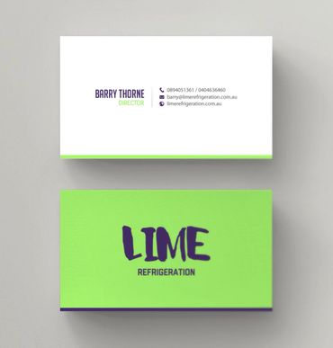
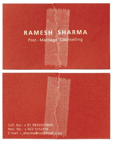
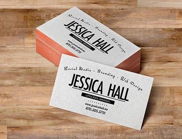
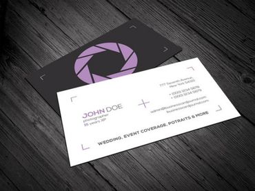
The main reason you give someone your business card is so they will have your contact information, but how much info do they actually need? Over the past decade business cards have become cluttered with all of the latest ways to connect...2 phone numbers, a fax number (yes, this is still a thing), street address, email, URL, and a dozen social icons. They scream desperation. Have a reason for every word and try to keep it simple.
The Minimum:
Name + Credentials
Email address
Depending on what you are trying to achieve there are multiple messaging options.
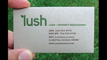
Below are some examples.
Examples
Copyright © 2024 Line2Lab LLC - All Rights Reserved.
Cookie Policy
This website uses cookies. By continuing to use this site, you accept our use of cookies. Cookies, yum!